Workshop On the Go

ProPlayer – Scrapbook Layout in progress

Well,  there is a workshop on Thursday and I’m not ready yet.  It seems to happen to me more in the fall than in February when the Spring/Summer idea book is released.  I think that might have to do with August being tractor driving time and September is trying to get into a new routine, harvest all the garden goodies and scrapbook!

ppfeatupclose1

I still have some more time tonight and all day tomorrow, so I’m sure I’ll have finish products for you to see by the end of the week.

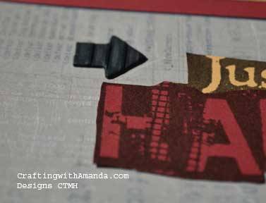
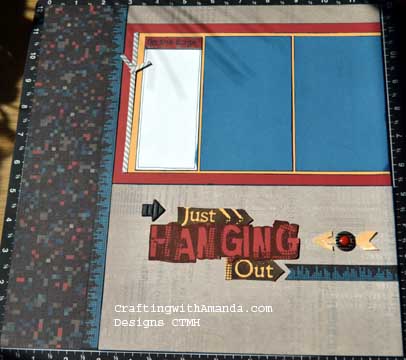
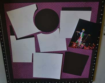
Here’s the layout from the ProPlayer workshop brochure.  I followed it almost exactly.  I didn’t stamp the black arrow, but instead used a textured one from the embellishments.

In hindsight, I think I would have liked to put a twist tie or bakers twine  around the arrow, but at the time I didn’t think about it.

ppfeatlt

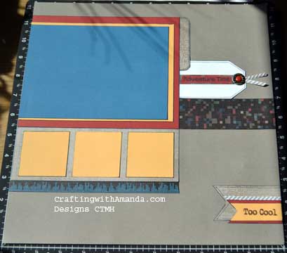
I don’t have any photos for this layout.  As I mentioned prior, I haven’t edited or printed any photos for over a year, and I couldn’t find any of our older prints that I wanted to use with this.

ppfeatrt

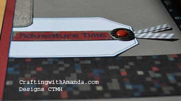
ppfeatupclose2Love the hand drawn line around this tag and some other embellishments.  It’s the little things that all seem to add up to the best layouts.  (That’s a shout out to the designers at CTMH for the scrapbooking workshops on the go!

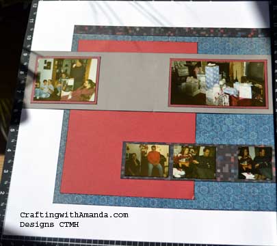
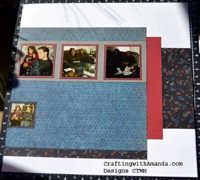
The next layout has photos, but no embellishing yet (well,  at least no embellishments at the time of the photo. I’ve been working this evening and have a title, journaling, and about 1/2 of the embellishments done.)

PPLO2lt PPLO2Rt

These photos are from the day after our wedding when we were opening gifts at my parents house.  It felt strange being the only one opening gifts, and I think some of the guests were more excited to see what we got than we were.  It took a lot of convincing for us to even register.  We just wanted to get married and start a life together under one roof (yes, old fashion).

I’ll have updates on this last layout, and the third one that hasn’t even been selected let alone started later this week! (Workshop is Thursday, yikes!)

Happy Crafting!


Techniques used on Laughing Lola Pages

Well,  here they are.  Most of these are probably familiar to you, but there are always new scrapbookers every day so maybe this will help someone.  Also, as my friend once said.  “When you do more, you can do more and you’ll have more.”  What she meant is the more techniques you use on a regular basis, the more techniques you will do without even thinking about it, then with the basics masters you’ll be able to learn more techniques,  expanding upon what you already have in your bag of tricks!  cuttingframes
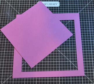
First Tip/Trick is a paper saver.

Some of the new CTMH paper packs have colors that are exclusive to that paper.  This is great in that we can stay trendy with our colors, but this can also pose a challenge as we might run out of a particular color and don’t want to purchase another paper pack for that one sheet.  To help stretch my exclusive cardstock colors from a kit,  if I’m using it for photo matting, I’ll cut the size I want, then remove the center to be used later.  In this example I cut a 1/2″ frame for my photo to be placed, then kept the center to use later.  punch from DE ScrapsYou don’t have to be exact on your cutting, just make sure your photo will overlap all sides.
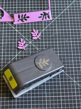
Another paper saver is using the left over scraps from dimensional elements and punching out shapes to use later.  These were punched from the edge of the Laughing Lola Dimensional Elements.cuttingribbonends
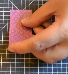
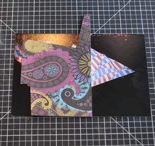
Do you know how to cut ribbon ends on paper so they end up being centered?   Here’s what I do.

First, as I often use scraps for my little do dads, they are rarely an even inch measurement.  To work around that, I center the paper on my cutting mat grid.  This allows me to clip a line up the center of the paper.  cuttingribbonends2It doesn’t matter how far you clip as you will becuttingribbonends3 cutting from the corners to the top of that line.
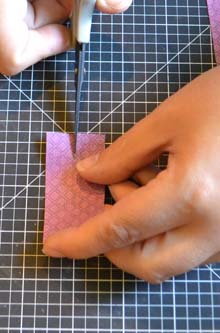
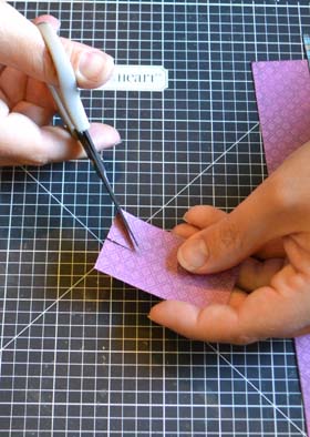
So, pick up your paper so you can see it and starting from the bottom corner angle your scissors to end at the top of the line you just clipped.  Do that for both sides.
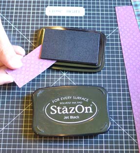
inkingribbonends


I often like to ink the edges of my paper to give it some depth.  Sponges can’t reach all the way into the corner, and I can’t be bothered to get out a cotton swap, so I use the corner of my ink pad.  you might need to push your paper in at an angle (unlike this photo where it just worked out perfectly).


LLFeatureRightDry

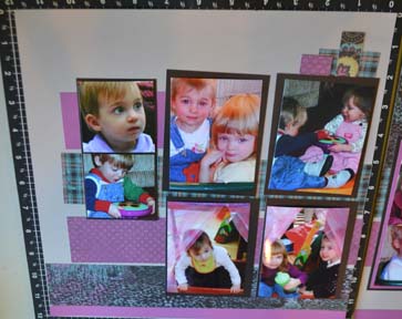
When I do a scrapbook workshop, I strongly encourage people to dry fit their layouts.  This will save many embellishment opportunities as well as give you a chance to “tweak” it to make it your own.    This is my layout not glued down.  I then decided I want to ink all the edges of the papers and the base page, cut the ribbon ends for my cluster in the top right corner, and rounded the corners of the strips poking out from the left of the photos.  I will also point out that the original pattern called for 2 x 2 photos on the left and I just couldn’t cut mine down that much so I used 2.5 x 2.5.  It meant I had to adjust the mat size for under them, but I don’t cut any of the photo mats until I’m doing the dry fit, so it was fine.  I’ve cut so many photo mats and not used them as my photos didn’t match exactly, that I now mark in my books which pieces are mats and I don’t cut them when I am cutting the rest of the papers.  The pattern used on this was the workshop brochure from the Laughing Lola workshop on the go scrapbooking kit.
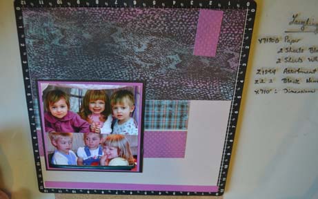
LLFeatureRightDryfitThe right side is also dry fit together.  See the mat that has the center cut out of it?  I have recently started double and triple matting and I love the look.  Soon I hope to shake things up and double and triple mat and twist them too!   Might be a little adventurous for me, but when I find the right photos watch out!

See my list of what products I used? (on the right)  I had an old desk from my Grandmother that had this on it and when we moved the desk out of the house I didn’t want the glass to break so we put it on my crafting table.  It’s actually been a great addition.  My four year old will come and draw with dry erase markers while I work and I can make a list of my products.  If I use a permanent maker, I snap a photo, then clean it off with rubbing alcohol.  By using a permanent marker I don’t have to worry about it rubbing off on my layouts.

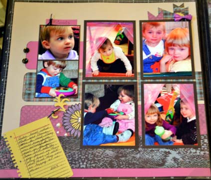
Here’s the finished layout.
LLFeatureleftFinish3aLLFeatureRightFinish


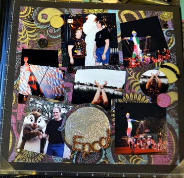
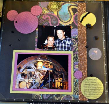
The next Layout uses two single pages. The right side is from the Artbooking cartridge (p87) and the left used pattern #17 from the Make it from your Heart Vol2 book.    I choose the Artbooking one because I was excited to do a Layout using the cartridge, and I choose the other because I had 2 photos left and it seemed like it would be a good fit.  I didn’t ink the edges, just punched out different size circles, cut the word “Epcot” on the cricut out of the bronze glitter paper.  I used the bronze glitter paper to balance the bronze strip on the left page.  I embellished with the punched circles, sequence ribbon from the black mini medley and also used the glitter buttons and single sequence from the medley as well.    Tips for getting your photos to fit just right in the overlay can be found here.LLFeatureleftFinish2 LLFeatureRightFinish2ahttp://www.craftingwithamanda.com/2013/08/09/laughing-lola-artbooking-layout/
Happy Crafting!
Laughing Lola Artbooking Layout

Once again we got rain, so no field work for me today.    Good thing I didn’t clean up my craft table so I can pick up where I left off last night!

I am finally getting to put together my first workshop on the go sample pages.  I learned a couple of things.  One, I really (REALLY) need to start editing my photos and get them printed as I am running out of photos in the house.  As I haven’t had any printed for over a year, it’s past time.  Second, I LOVE the CTMH Artbooking cartridge.  It has so many cool images, page layouts, photo mats . . .  I’m just thrilled.

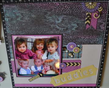
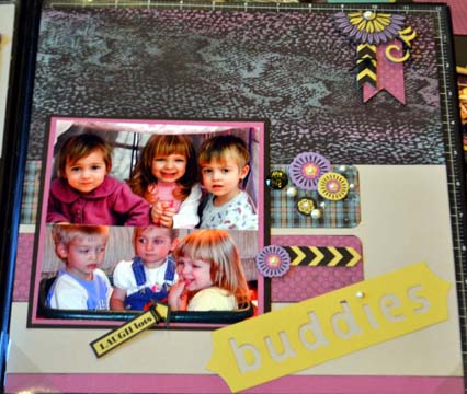
So, here are the two layouts I completed yesterday.  The first one is my version of the workshop layout.  LLFeatureleftFinish3aLLFeatureRightFinish3a

The original artwork in the Laughing Lola workshop used three small strips for journaling.  That was not going to be enough for me on this page, so I broke out Artbooking and cut the cute “notebook” page and stamped it with the lines stamp (provided in the cartridge bundle so conveniently).  I love dimensional elements and I have more embellishments than I could probably use in a lifetime so I just kept adding flowers, pearls and  baubles.  I also cut the title “Buddies,” and added it to the bottom corner.  I’ll have more detailed instructions for cutting the paper ribbon ends and some of the techniques in a future blog.


LLFeatureleftFinish2

LLFeatureRightFinish2a


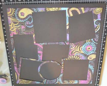
This second layout is a combination.  I used the overlay from p87 of Artbooking for the right page and pattern 17 from Make It From Your Heart Vol2 for the left.  I very rarely create single pages, but with all the photos for this layout it worked out great.


LLLO2Rightdry

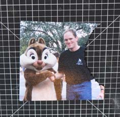
Here’s my tip for the day.  After you cut an overlay for photos, keep all the cut out pieces to help you cut your photos to fit.  overlayphotoplacement

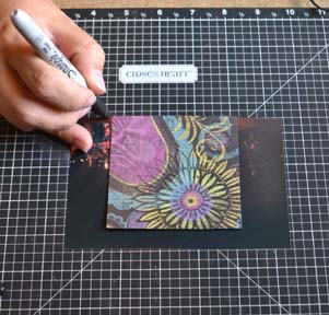
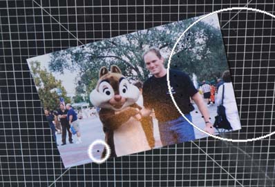
Once I decided what part of the photo I was going to use, I took a permanent marker and put dots on each of the corners. In hindsight, I would give myself more edging so I will place my dots farther away from the photos.

Photomarkingforoverlay overlayphotomarking


overlayphotocuttingLLLO2rightattachingphotosOnce I got all the photos trimmed I turned the overlay over and attached them to the paper.  If I had any open areas, I cut a piece of paper from the photo space paper and glued it down as well.  I used the back side as my paper pattern was busy it just blended in,  but you could use the exact piece to put back and the pattern would match exactly.

It’s hard to describe, but I’m hoping the photos will help.   More details on my  next blog!

Happy Crafting!


More Babycakes Cards

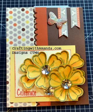
babycakesflowerletter   I don’t know about you all, but I am definitely a visual person.  I do enjoy reading, but when I am on the internet, I really like to see photos and even some ‘how to’ ones along the way.  (even if they aren’t so pretty!)  That being said, I am trying to include what I would like to see.

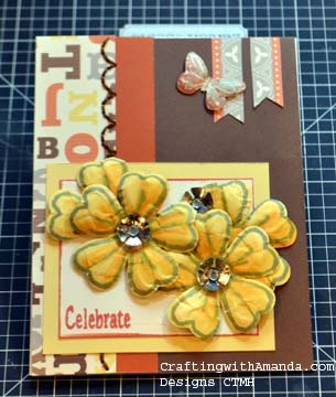
I made this card, two versions actually with the left overs from the two previous cards.  I should have been cleaning up my supplies and transitioning over from spring/summer to autumn/winter products, but these scraps were just sitting on my desk waiting to be used!

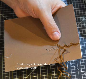
The card front is chocolate CS.  On that I placed a left over strip with letters to the left and another scrap of autumn terracotta next to it.   I used the brand new stitch guide to pierce some holes in a scallop pattern, then using a simple backstitch filled in the holes with chocolate floss.

The new stitch guide is amazing.  You just line up your paper with one of the grid lines and using a piercing tool punch through each hole.  I’ve found I work faster if I punch through the front with the piercing tool, but stitch holding the card with the back side facing me.

stitchingdryembossingstep1

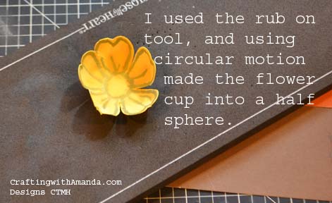
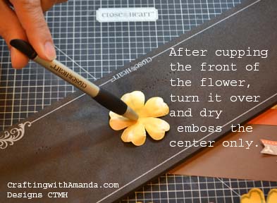
If you don’t know this, I love that the cricut cartridges work with our stamp sets so perfectly.  I used Art Philosophy and an old workshop stamp set “Lucy” to create these flowers.  I cut them out of colonial white and then colored them using buttercup and sorbet makers.  I stamped the flower outline in slate.  After they had dried I used the rub on tool and the mat for the stitch guide and dry embossed the flowers.  (see photo right & below.)

dryembossingstep2


I forgot to mention I was using card number 28 from the Make if From your Heart Vol2 as my inspiration piece.  I cut a scrap of buttercup cardstock (3.5×3) and Colonial White CS (2.5 x 3).  I matted the colonial white on the buttercup and stamped the word “celebrate.”  I then attached the flowers with glue dots and added the new metal flowers.

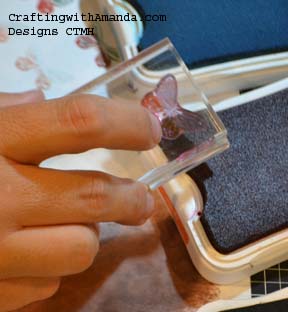
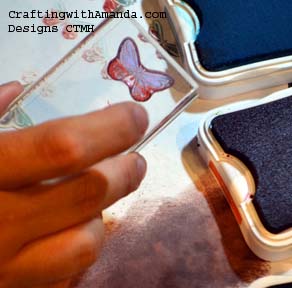
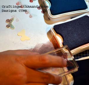
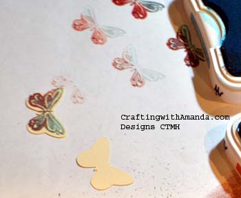
Each CTMH pattern paper comes with a zip strip along the top that tells the paper name and coordinating colors on one side and some patter or words on the other.  I cut two pieces from the zip strip (1.25 & 1.5), made ribbon ends on them and attached them to the upper right of the card.  The inspiration piece had a button as an accent, but the Lucy stamp set had a butterfly that coordinated with the Art Philosophy cartridge, so I cut out a butter fly and then rock and roll stamped it to create the multi colored wings.  Always practice so you can get the feel of how far to roll the stamp into your ink.  (see my scrap paper!)

rocknroll1

I always line my colors up lightest shade to darkest.  This will help me from putting darker ink on the lighter pads.  So I ink my full stamp in my lightest color.  In this case Crystal blue.

rocknroll3

In the next color, sunset, I tip the block to just get ink on part of the stamp.  (The bottom of the butterfly)


rocknroll4

You can see where you have your ink when you use Acrylic Stamps.  (another reason to love them!)

rocknroll5


Then with my darkest color, Slate, I roll the top of the butterfly into the pad..  You can see on my scrap paper that I practiced a few times to help me reach the effect I was looking for.  I didn’t like the rocking and rolling I had done in a different order, but when did it the way described above I liked it.  I recommend doing several different combinations of coloring to find what works for you and your project.  Once you have it all inked up, line it up on your precut shape and watch your butterfly transform.  I have a small craft foam pad under my scrap paper.  It helps ensure a good stamped image.  You can also use the foam that comes in the My Acrylix stamp sets as well.rocknroll6After I stamped the butterflies, I added some more Slate ink around the edges to blend the colonial white CS that was peaking through.

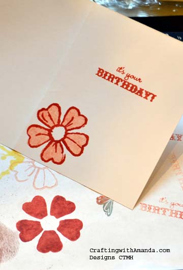
generationstampAnother stamping technique I used on this card is second generation stamping with our two stamp images.  Still using the Lucy stamp set, I inked up the solid flower petals in Sunset and stamped it on my scrap paper, then without re-inking I stamped it again on the inside of my card.  This made for a lighter shade of Sunset.  Then I used the outline flower stamp and sunset and lining up my image stamped over my solid flower petals.  I will sometimes drag the bigger solid images across the stamp pad to give it a different effect, or twist it.  Try out several different inking scenarios to see what will work best for you.

Here’s a look at the other card.  Everything is about the same except I dry embossed the flowers so the petals would curl up and I used the polka dot side of the patterned paper on the left edge.  I also choose a different stitch pattern so I can learn what I might like to use latter on my scrapbook projects.


Happy Crafting!

babycakesflowersdots