Artwork

Sitting bolt upright!

Hi Ladies,

I realized (in the middle of the night when I sat upright bolt awake) that I did not finish posting the photos from the library auction scrapbook layouts.  I will try and get those finished in the next few days!

We have been busy here at the Farm.  I had a women’s retreat, then the next day our family boarded a plane to FL to visit with Grandma, Uncle, Mickey Mouse, Harry Potter and several other friends.  We returned two days ago and luckily had a snow day yesterday to help us dive back into life.  I had hoped to do this post yesterday, but as in all things, life happened and I got to spend another 5.5 hours in a car.  Even though we didn’t change time zones, I am feeling jet lagged.

So, with out further ado, more library auction pages.

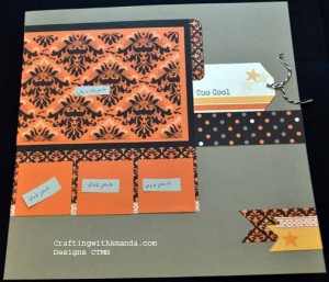
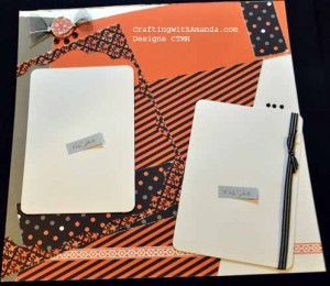
LNOLeft LNORight

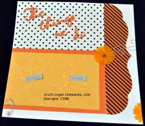
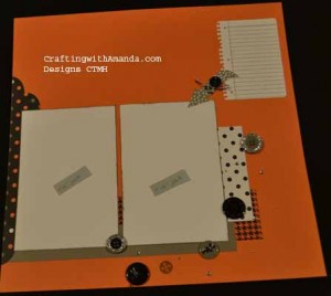
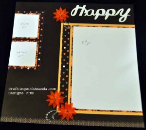
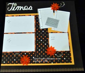
I really like how clean these pages look.  If you haven’t noticed, I’ve gone back to matting all my photo spaces.  Sometimes even double and triple mats.  Love the layered look, and have decided I have enough paper and cardstock to use it this way.  <grin>
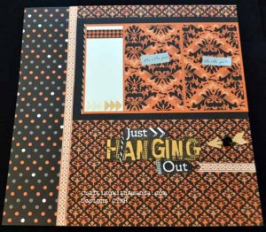
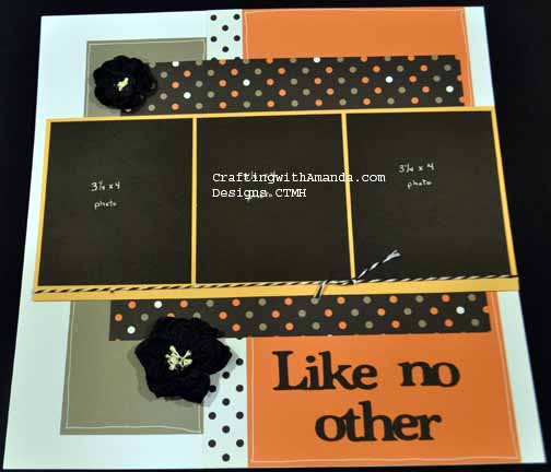
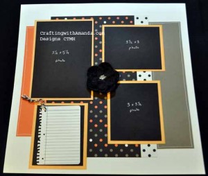
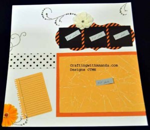
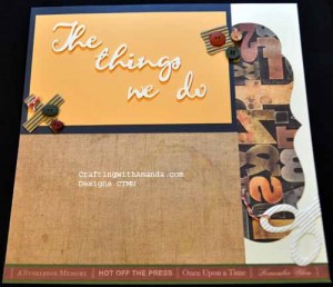
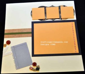
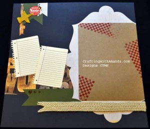
JHOLeft JHORightDifferent journaling spot this time as I didn’t include the “notebook” page, but again, crisp layout really speaks to me.  This was a workshop on the go feature layout.  (I think from ProPlayer paper.) SPLeft SPRight
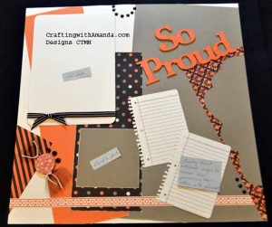
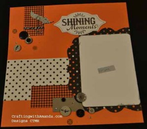
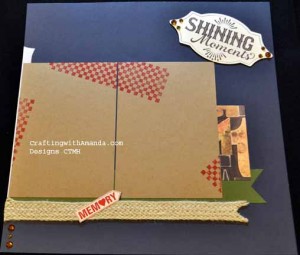
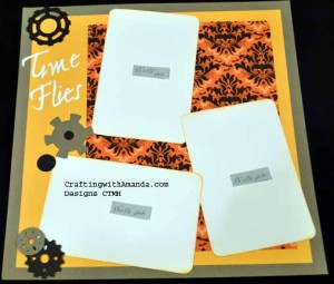
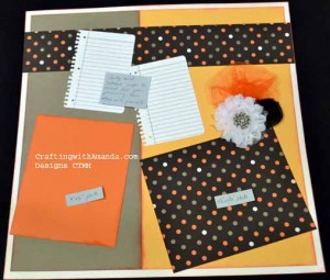
“So Proud” was done with scraps.  I used the frame from the Shining Moments Layout and then just layered on more scraps that I had lying on the table.  It definitely fits into the whimsical category!

Thanks for looking.  I hope to be better about posting new artwork.  Now that January is almost over, I think I might have some time to catch up on things.  We have club day tomorrow, and I haven’t even figured out our project!  yikes.  (It’s all good though, I have lots of ideas.  Just need the time to play with my papers!)

Happy Crafting.
Frosted Workshop Layouts

Yesterday we had a lot of fun at the Frosted workshop.  We started with laughs and ended with contented ahhh’s after we each enjoyed a paraffin wax treatment for our hands.

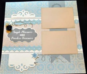
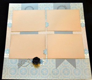
Here’s the Layouts we did.  We used the Artist Cartridge for the first layout, and the Arbooking helped with our photo mats on the 3rd set.

Feature Layout:

frosted1left Frosted1right


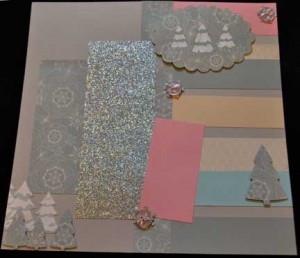
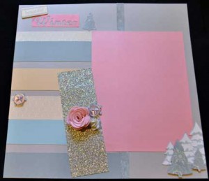
Next Layout I choose to add Blush Cardstock, but one of the gals choose Smokey Plum.

frosted2left frosted2right


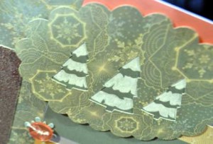
I used the trees from the Frosted Stickease, and cut some more using the Art Philosphy Cartridge and pop dotted them over the snow covered stickease trees.

I chose a scallop with the trees cut out.  I then glued the frosted grey to the back and using a white gel pen created my own “snow covered trees.”

Frosted2trees

The last layout I wanted to create something that was not “winter” themed so that my gals could visualize this paper pack for something other than winter activities.  I really like how these pages came together.

frosted3left Frosted3right


The pencils on the bottom left corner were created by turning an arrow stamp upside down and inking up the backside of the stamp.  Then wiping the tip of the “pencil” across the ink pad to remove some ink, then re inking the “lead” of the pencil.  It was so easy and I love the results!

Happy Crafting!


Library Auction Pages – Third Helping

Well,  here’s the next pages for your viewing & learning pleasure.

TTWDLeft TTWDRight

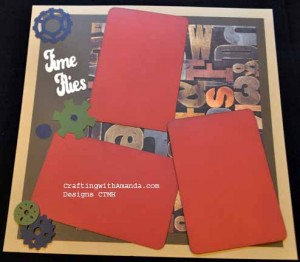
The titles are the same, but the paper sure does make a difference!

SchTTWDLeft SchTTWDRight

The title for the next pages came about because I had taken a break from this donation scrapbook and did some prep for the upcoming Sparkle and Shine workshop.  I loved how the stamp & cricut shape worked so well together, and as it’s a title that could be used for many different photos it would work well in this book.

SMLeft SMRight

SchSMLeft
SchSMRight

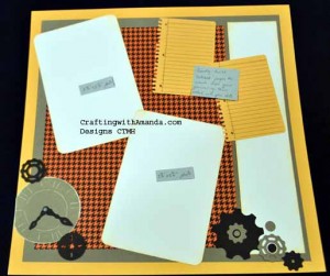
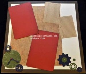
I don’t know about you, but I often struggle with generic embellishments that are not “girly.”  Gears, clocks, and keys  are a great  fall back if you don’t have a sports theme or other defining theme to help you.

(Really pleased with how both sets of these turned out!)

TFLeft TFRight

SchTFLeft SchTFRight

Come back soon and check out the rest of the pages.   I think it’s only a few more posts and you’ll be caught up on the pages I’ve finished.  The scholastic book is a work in progress, but as I turned in the Spellbound  album for the auction today, it’s DONE!

Happy Crafting!


Library Auction Pages – Second helping

I forgot to mention this the other library Auction post, but if you want to see the layout in more detail, you should be able to click on the photo and it will give you the full size version of it.  Then use your “back” button to continue viewing the rest of the blog.
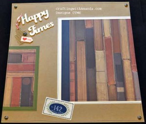
Here are a few more pages for your crafting inspirations.
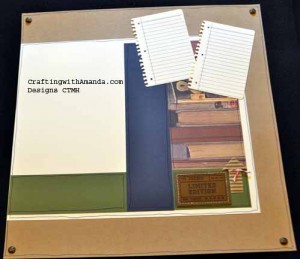
FYLeft FYRightYou might not see it right away, but both of these layouts were cut using the same instructions.  It still amazes me how much paper and embellishment choices (along with title and placement) really change the looks of a page.

SchKBWWRight

If you haven’t figured it out yet, since I know, or atleast have a really good idea what photos I will be putting on these pages, I can be more specific with my embellishments!SchKBWWLeft


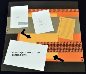
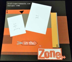
ITZLeftHere is the left side of the “In the Zone Layout.”  Where you see the white cardstock, it represents my recommended photo placement.  I think this will look great when the white is removed and some sport action shots are taking that space!

ITZRight

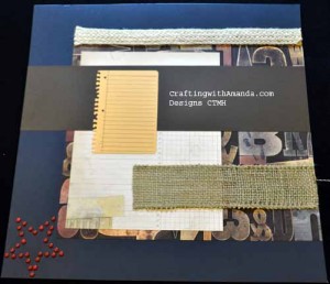
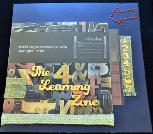
Now, once again these layouts use the same pattern, but instead of paper for everything, I used some burlap ribbon.  I also changed my title to the learning zone as I will be filling this with school pictures for my own albums.

SchTLZLeft

SchTLZRightDid you see ALL the cranberry brads I used to create the arrow and star?   (I used cardstock cut out on the Cricut Artbooking and poked holes around the outside edge, then filled each of the holes with brads.)

Hopefully I’ll get some more photos edited this week.
We are coming back from a great weekend celebrating our Nephews wedding, so I haven’t been able to do any computer work for the last few days.  We are staying home for a quiet Thanksgiving and perhaps I’ll get some more “work” done then?!

Happy Crafting!

Library Auction Scrapbook pages – Introduction

Hi Everyone,

Our local library is located in our school and serves as both a community and a school library.  Every year that I’ve lived here, they’ve held a silent auction to raise money for the library.  In the past I’ve participated by donated a decorated tree (won an unexpected prize for that) and homemade cards.  Some of the items donated have included homemade canned goods, craft items, gift certificates for local businesses, quilts and a variety of knick knacks.  I have felt nudged to do something, so this fall when CTMH put the Spellbound papers on sale I decided to do a scrapbook.  Our school’s colors are Orange and Black, so this seemed like a great fit.

Now that you know the history, here is a look at some of the pages.  Many of these pages were created from the workshops for the current papers.  I would do my sample pages, but on the day of the workshop when we would walk through cutting all the pages, I would use Spellbound papers and cut for this scrapbook.  I’ve enjoyed this project so much, I’ve started another one with the retired Scholastic papers for personal use.  There are a few pages that are unique to each book, and the Scholastic layouts aren’t all finished.  I just cut 3 more layouts at the Huntington Workshop this week.   (And yes, I will post the Huntington Layouts soon.)

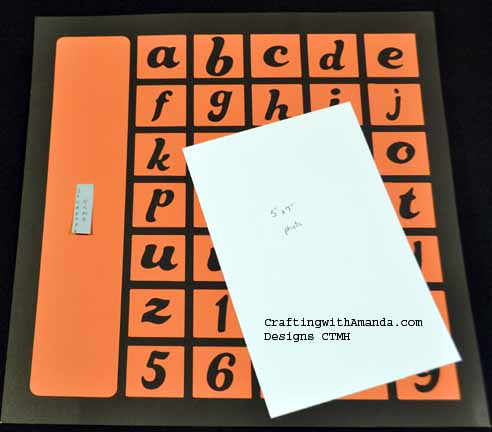
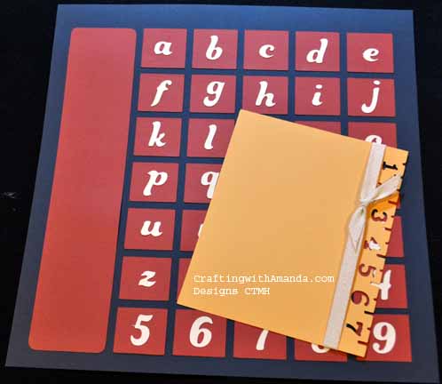
The covers are very similar and are actually  the “negative” cuts from another layout.  They were cut using the Artbooking Cartridge.

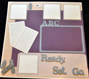
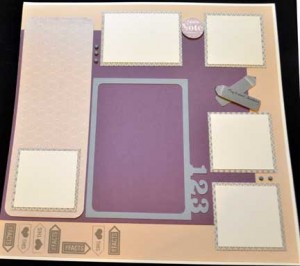
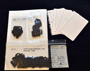
Cover SchCoverI rotated the “calendar” counterclockwise and provided capital  & lowercase letters so the students name can be listed in the rectangle on the left.  On the words-lettersSpellbound pages, the  white cs represents where a photo would go.  The instructions that will go with the book will explain that.  As I am good with photo editing, I left a spot for an odd size (4.5 x 6.5) photo to go on the crème brulee mat.  Here’s a peak at the letters and words that I am including with the scrapbook “kit.”

I’ve also included some extra “journaling” pages incase they need more or make a mistake.

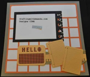
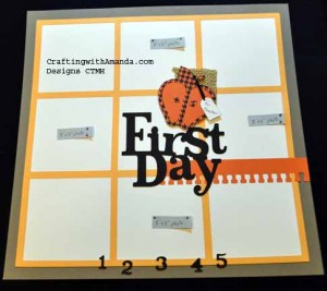
Now you’ll see the “Calendar” page that I paired with the “first day” page.  We have many students that ride the bus, so I included many spaces for photos.

FDLeft FDRight


By matting my “calendar” frame on white daisy it helped it pop.  I haven’t done this page from the scholastic papers yet, but I’m thinking I’ll stamp school images in the squares.  Maybe even sneak in a photo or two.

HTLeftHTRight

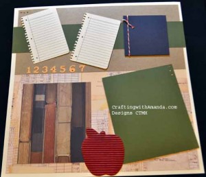
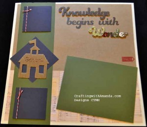
These two layouts are from the same Make It From Your Heart Layout, but with the different colors and the use of Kraft paper as a background, I think it’s hard to see it right away.  I added hand drawn lines around all the different pieces on the scholastic layouts.  Gives it a hand stitched feel.  Love the durable studs!

More pages to come.  Happy Crafting!


SchHTLeft SchHTRight